Layout Adaptation
The displays (widgets) on navigation and dashboard pages are controlled by a configuration json file ("layout"). A couple of predefined layouts are included with AvNav. They all have the "system." name prefix. As a user you can define your own layouts and store them (they will have the name prefix "user."). Those user layouts will be stored at a folder "layout" below the BASEDIR (/home/pi/avnav/data on the raspberry). You can directly edit those files, download and upload them - or you can modify the layout using the built in layout editor.
The preferred way of changing a layout should be the layout editor as this is the least error prone way.
The active layout can be set via Settings  /Layout.
Layout Editor
You can invoke the layout editor via the Settings page , Layouts  .
.
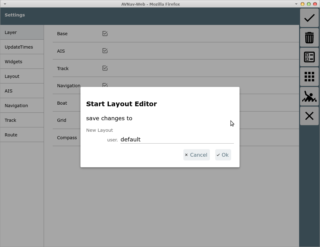
This dialog asks for a file name for the layout to be modified. If a system layout is active (that you cannot change) a new 'user' layout with the same name will be created and activated. If the layout already exists you can decide to overwrite it - or just choose a new name. You can still decide at the end of the editing process to discard your changes.
After starting the layout editor a red frame will be displayed - only pages where you can adapt the layout are visible.
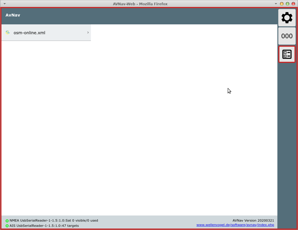
By selecting a chart you can open the navigation page as usual.
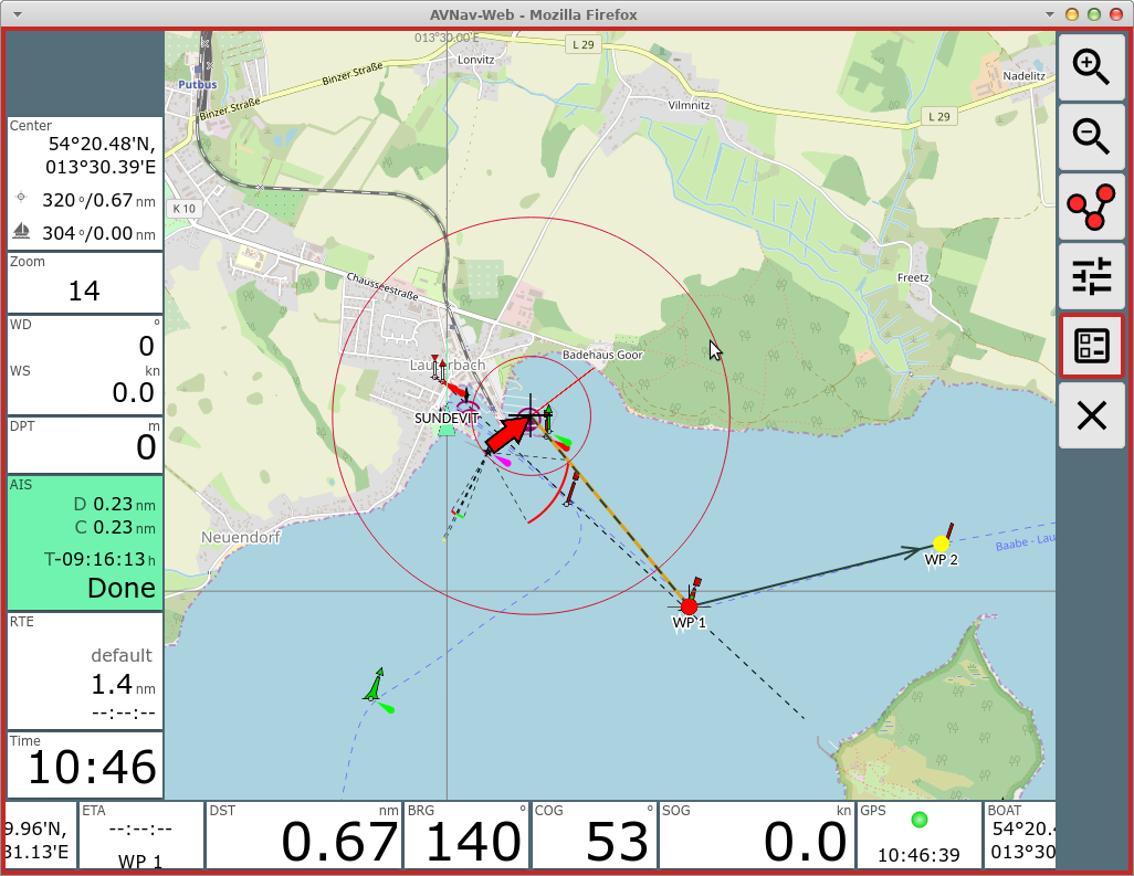
All widgets are located in so called "panels". You can drag and drop the widgets as long as editor mode is active.
On the navigation page you can assign different widgets to the panels depending on your display width. On a small display (value can be changed at Settings/small display) you can have different panels than on a large one.
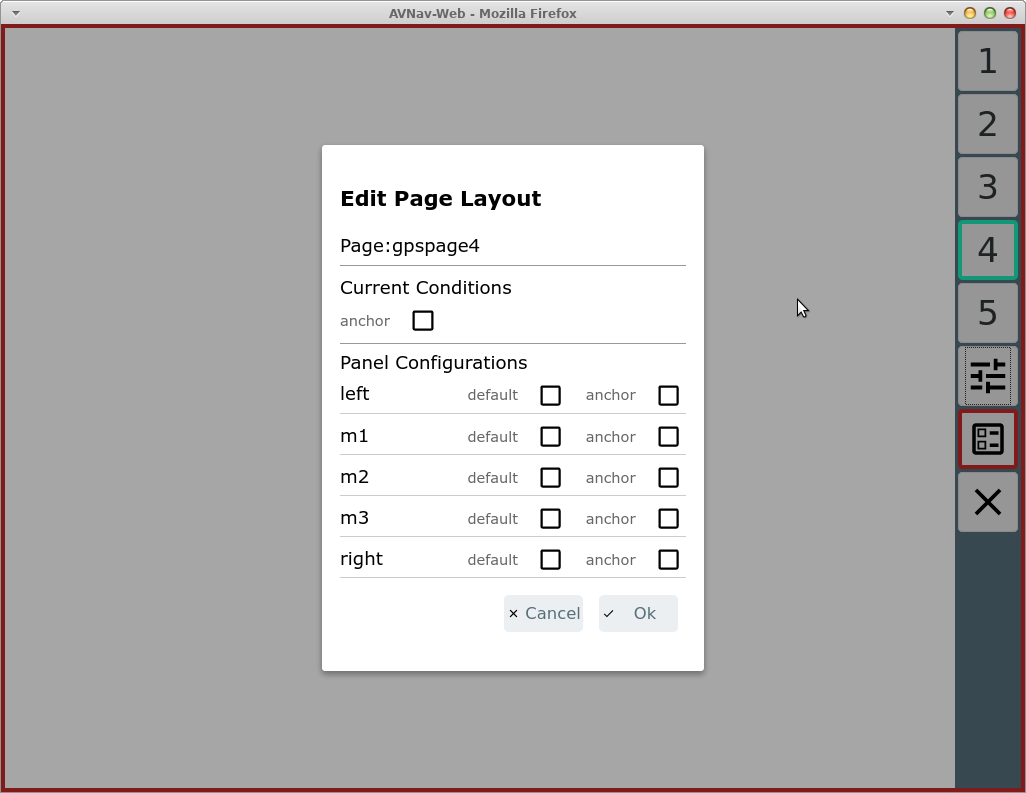
Via  you open a dialog to configure the panels on a page.
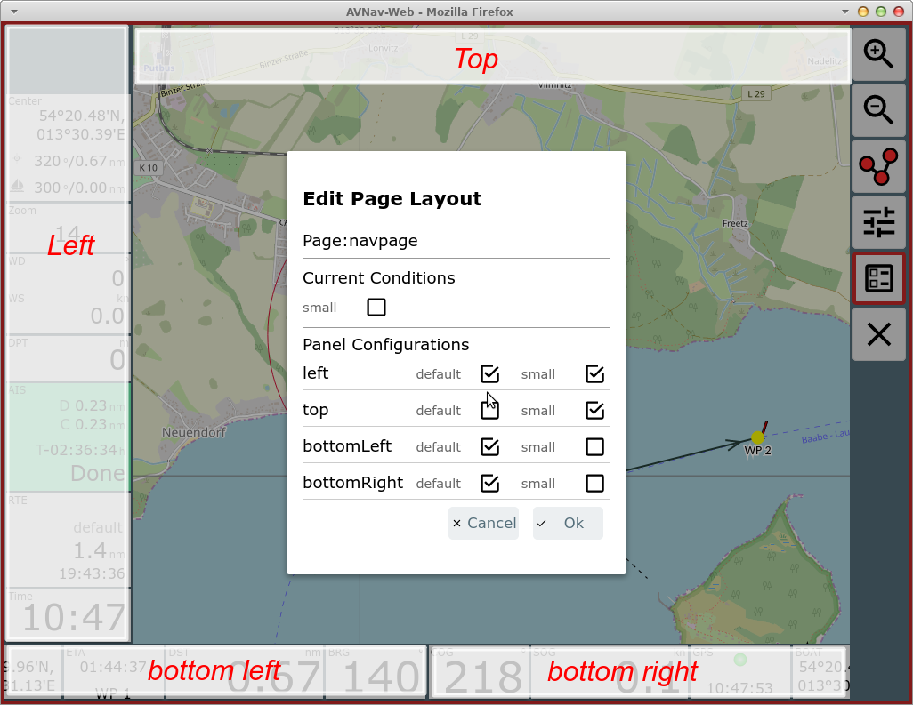
The available panels are marked red in the screenshot. You can select which panels should be visible - depending on the display mode (small/default/anchor/anchor+small). If the "small" checkbox is checked you define a different set up for the small mode. The same is valid for the mode "anchor" - i.e. when the anchor watch is active. In the example above the top panel is not visible in normal mode, the left panel has a different content in normal and small mode, whereas the bottom panels have the same content both in normal and small mode. The bottom left panel has a different content when the anchor watch is active. At "current conditions" you choose for which conditions you are editing. To complete the page in the example you need to edit in: normal mode, small mode, anchor mode (no small).
Both the bottom panels may have 2 rows of widgets (Setting: "2 widget rows"). Widgets that do not fit any more will be hidden completely.
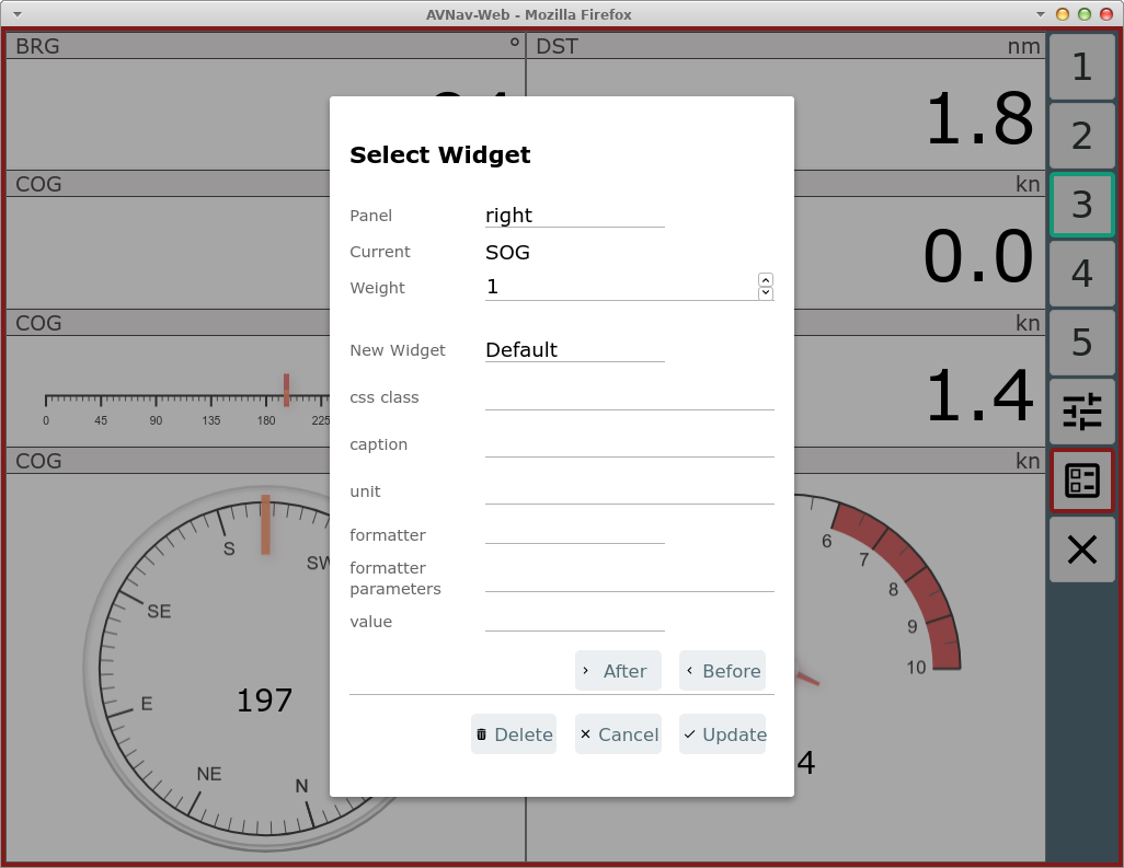
Widget Dialog
After completing the panel dialog you can move the widgets within the panels or click on a widget or a panel's free space to open the widget dialog.
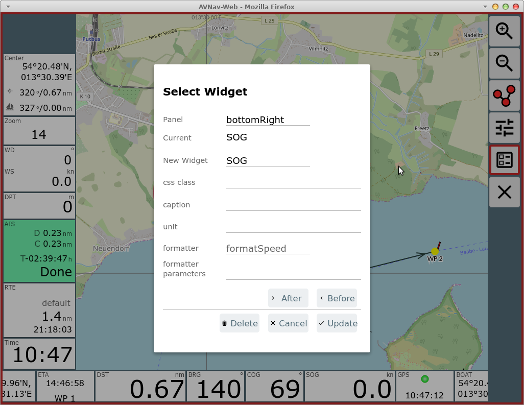
Depending on the kind of widget the dialog will contain different settings.
If you would like to move the widget to another panel you can select the target panel in the top entry of the dialog (or use drag and drop when the dialog is closed).
"Update" will store your changes.
By clicking "New Widget" you can select a new widget from a list of available widgets.
Each widget requires information about the data to display. All displayable data are internally available in a store and each item is addressed by a key.
Depending on the type of widget, the key(s) it uses to fetch the data from the store is either fixed (i.e. built in) or has to be chosen in the dialog. Caption, unit and the css class can be set for most widgets. Assigning a css class is useful if you want to adapt the appearance via css.
Formatter
Most of the widgets need a formatter to convert data from internal format into the display format. In most cases the formatter used by a widget is fixed. Some, however, allow parameters to be assigned in this dialog - e.g. you can change formatSpeed to convert to m/s instead of kn.
The parameters of a formatter are visible in the dialog with the prefix
"fmt:" - "fmt:unit" in the example.
The list of those parameters is defined at the implementation of the
formatter (see user defined formatter).
If a formatter has a "unit" parameter the value of this parameter will be used to be shown as the unit in the widget (although some widgets still allow to overwrite the unit in the dialog).
The list of formatters (and their parameters):
| Name | Description | Parameter |
| formatDecimal | format a decimal value | fix: min number of fixed digits fract: number of fractional digits addSpace: if set add a space for positive numbers prefixZero: if set - use zeroes as a prefix to reach the number of fixed digits |
| formatDecimalOpt | format a decimal value fractional digits are only shown if the value has a fractional part |
same as formatDecimal |
| formatDistance | distance in nm/m/km | unit: nm - distance in nm m- distance in m instead of nm km - distance in km instead of nm |
| formatSpeed | speed in kn|m/s|km/h | unit: ms - m/s instead of kn kmh - km/h instead of kn kn - kn |
| formatDirection | formatting degrees | inputRadian: - input in rad instead of degrees range180: map the value to +/- 180° instead of 0...360° leadingZero: always show a 3 digits value |
| formatDirection360 | formatting degrees | leadingZero: always show a 3 digits value |
| formatTime | Time value (internal value must be Date) (hh:mm:ss) | |
| formatClock | Time value (internal value must be Date) (hh:mm) | |
| formatDateTime | Date and Time (internal value must be Date) | |
| formatDate | Date (internal value must be Date) | |
| formatString | pass through | |
| formatTemperature | format temperature (since 20210106), input in kelvin | unit: celsius, kelvin |
| formatPressure | format a presssure (since 20210106), input in pa | unit: pa, hpa, bar |
Plugins or custom extensions can potentially add more formatters.
If you do not want to change the existing widget but add a new one - just select "Before" or "After" to insert it.
If the widget supports further parameters they will be displayed in the dialog.
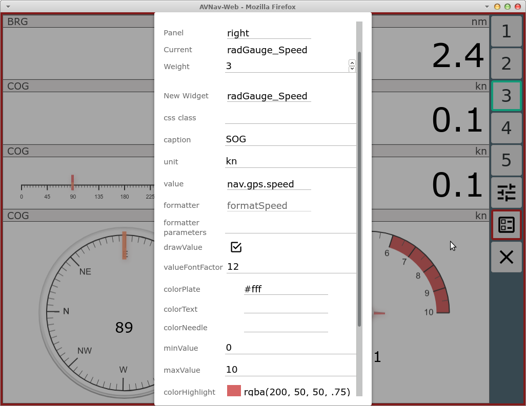
In the example a configuration for a graphics display (internally canvas-gauges is used).
From the navigation page you can switch to the dashboard pages via the main page.
Dashboard Pages
You can configure up to 5 dashboard pages. Each of them can hold up to 5 panels.
On an empty dashboard page you have to start with the panel configuration
- .
You can define a different layout for anchor watch state (this feature is used in dashboard page 1 of default layout).
Dashboard pages without panels will not appear in the live display.
Principally you can also modify the the route editing display ( from the navigation page) however the
currently edited route and the list of waypoints must remain visible there
at all times.
from the navigation page) however the
currently edited route and the list of waypoints must remain visible there
at all times.
When you are done with the layout editing you still need to save your
layout using the button (red border) on each page.
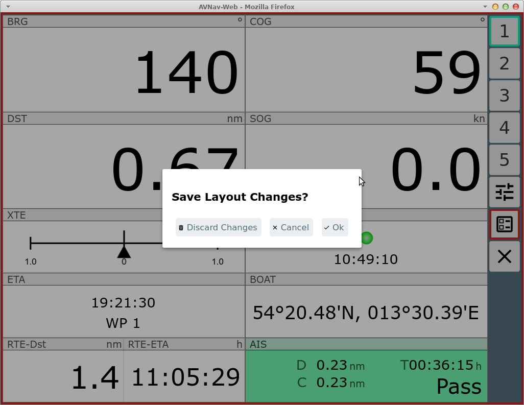
At this point you can still decide to discard all changes.
The saved layout will immediately become active in your current browser (and will be stored at the server). Other browsers will only use the new layout after reloading the app or changing their active layout.
Roll Back
When you are editing a layout you will have a  RollBack button. Clicking this button will
revert the changes you made in the layout (one after the other).
RollBack button. Clicking this button will
revert the changes you made in the layout (one after the other).
Combined Widget
To give you more flexibility in arranging your displays (widgets) there
is a combined widget that can contain a number of sub widgets in one row
or one column. This gives you more flexibility to utilize the space e.g.
on dashboard pages.
To place a combined widget use the normal widget dialog and select
"CombinedWidget" as New Widget.
Afterwards use the "+Sub" to add the contained widgets - this will give
you a normal widget dialog for them.
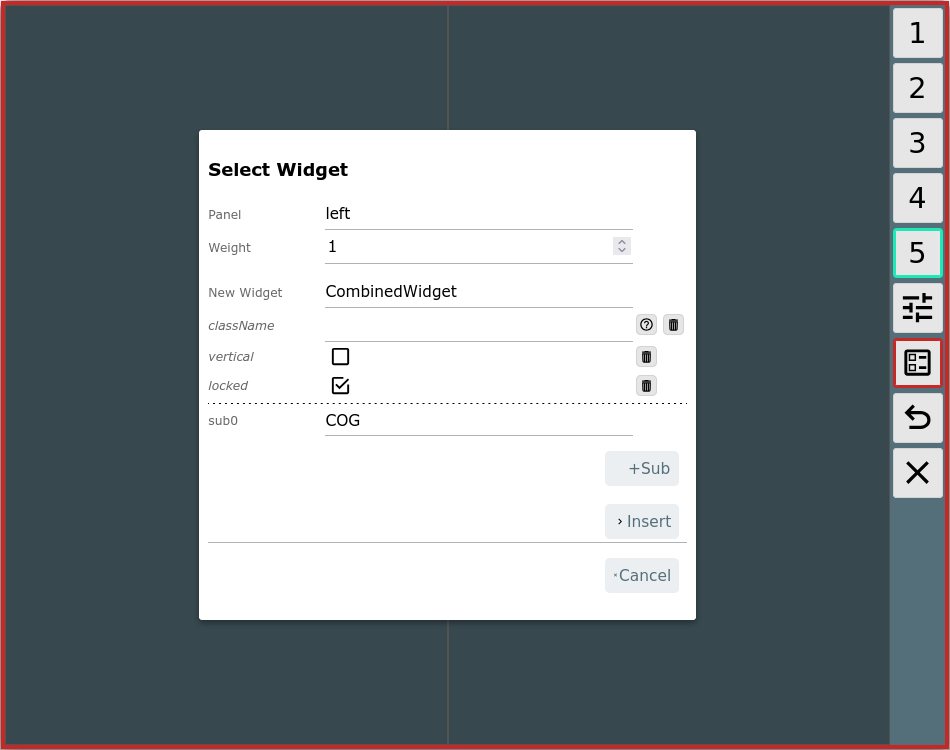
You can select if the child widgets should be in horizontal order
(default) or vertical order.
With "locked" you decide how the widget should behave for drag and drop in
the layout editor. With the default "locked" it can be moved as one
widget, without locked you can drag and drop the child widgets.
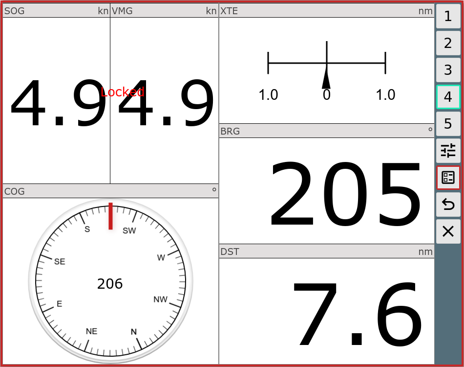
The example shows a dashboard page with some "normal" widgets and a combined widget in horizontal order.
Layout Download/Upload
Via the Files/Download page  , subpage you can download/upload/edit and delete the
layout files. The currently active layout and system layouts can only be
downloaded.
, subpage you can download/upload/edit and delete the
layout files. The currently active layout and system layouts can only be
downloaded.
If you delete a layout currently loaded by another browser, this browser will write the layout back to the server when it reloads the app - so the layout will reappear.
Special Widgets
In addition to a long list of predefined widgets (like SOG, COG, BRG, AisTargetWidget, ... where you can only change the caption, unit, formatterParameters and css class) there are a couple of special widgets.
Default
This widget internally serves as basis for most simple display widgets. But you can also use in the layout editor it to display custom values.
In any case you need to select a value (the key for the data store) and a formatter.
When clicking "value" you will be prompted to choose from a list of available data.
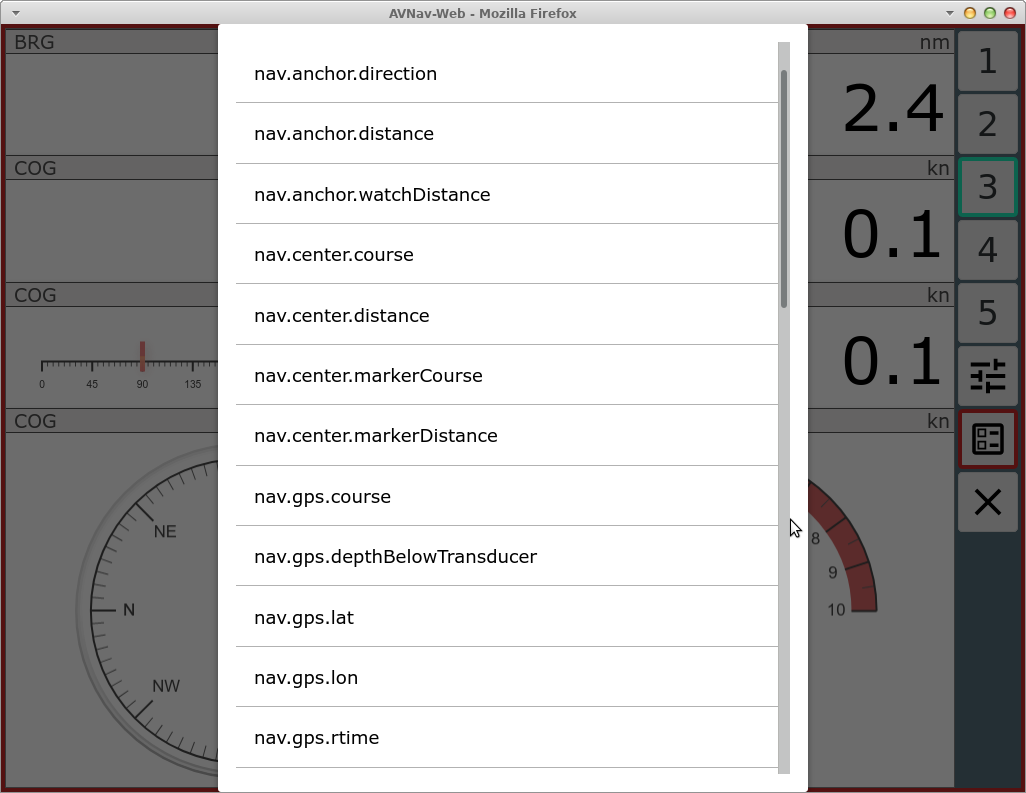
First of all those are the values predefined internally in AvNav. If you have enabled the signalk integration you will also see all received values from signalk (below vessels/self) with a prefix nav.gps.signalk.
You have to take care to select a formatter that fits the value you selected.
Gauges
As already mentioned AvNav integrates canvas-gauges. AvNav preconfigures a couple of widgets based on this library. Their parameters can be set in the layout editor.
There are linear gauges (linGauge...) or radial gauges (radGauge...).
Via the layout editor only a couple of the possible parameters can be set
directly.
If you want more control or utilize different features of the canvas gauges library you should define own widgets as described in adapting with user specific java script code .
SignalK
The signalk integration also provides a couple of widgets - they especially contain formatters for values that are otherwise not included in AvNav like signalKCelsius to display temperatures in °C.
They only make sense if you have appropriate signalk data, of course.
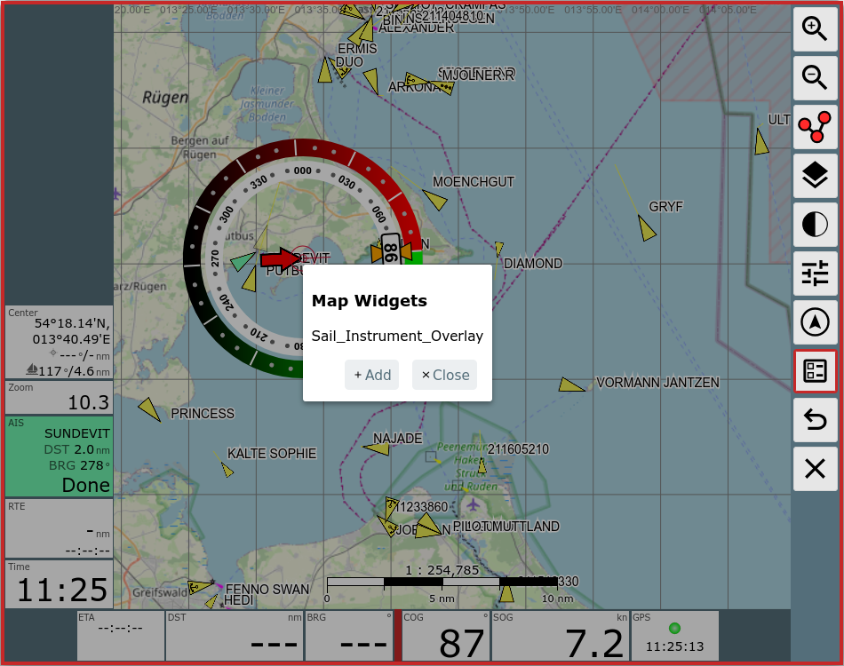
MapWidgets
Users or plugins can create MapWidgets. Those are drawn directly on the map and can use information about the current map position. One example is the SailInstrumentOverlay widget from the Sail Instrument plugin.
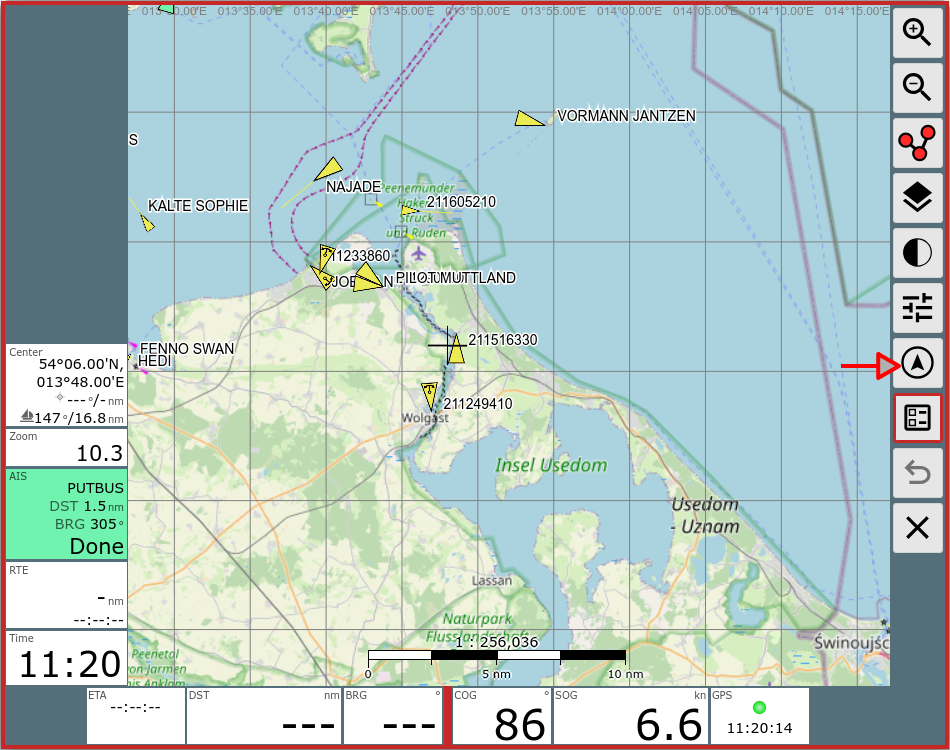
To edit those widgets use the  MapWidget Button on the navigation page.
You will get a dialog to add/edit/delete the widgets on the map.
Please keep in mind that clicking on the widget on the map will NOT bring
up the edit dialog (like on other widgets) - you always have to use the MapWidget
Button. As the position on the map is determined by the widget itself
there is also no drag and drop functionality for those widgets.
Adapting the Look and Feel of a Widget
If you would like to adapt the look and feel of a widget you should add a css class to it. Afterwards you can assign rules to it in your user css.
Own Widgets
With user defined Java Script Code you can easily create your own widgets - both with simple HTML and with canvas based graphics.